Add Row
Add Element
cropper
update

VSEO Digital Marketing 

cropper
update
Add Element
  • Home
  • Web & SEO
    • Conversion Ready Website
    • Get Found on Google (Local SEO & GBP)
  • Content & Authority
    • Build Authority with Blogging
    • Engage Audiences with Social Media
    • Stand Out with Short-form Video
  • Growth & Ads
    • Win Trust with Reputation Marketing
    • Reach More Customers with PPC Ads
  • Insights
  • All Posts
  • Reputation & Reviews
  • Local SEO
  • Conversion & Websites
  • AI & Marketing Tools
  • Industry Trends & Policy
  • Case Studies
  • Local Ads & Paid Media
  • Content & Authority Building
October 03.2025
1 Minute Read

Contractor Landing Pages That Convert: 7 Patterns That Work

Is your contractor business attracting plenty of visitors—but few leads? Discover how the right landing page design can turn wasted traffic into high-value clients, effortlessly.

Are You Wasting Contractor Traffic? How Mastering Landing Page Design Changes the Game

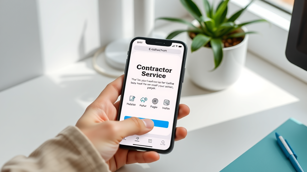
Many contractors pour time and money into driving traffic, but what happens when visitors arrive? If your landing page design isn’t laser-focused on conversions, you’re not just leaving opportunities on the table—you’re practically handing them over to your competitors. Unlike general web page designs, contractor landing pages must guide users from curiosity to commitment in seconds. Aligning every element of your web page with a clear marketing campaign goal—whether scheduling a quote, downloading a resource, or booking a consultation—is how true conversion breakthroughs happen. In this article, you’ll discover actionable strategies and proven design patterns that can elevate your contractor landing page from overlooked to irresistible. Start putting every click to work, and see just how dramatically your pipeline fills when your landing pages are designed not just to look good, but to drive real results.

By leveraging the power of an optimized landing page, contractors can harness web traffic from sources like paid ads, email marketing, and social media posts, and funnel it directly into actionable leads. This approach to landing page design is about more than looks—it’s about performance. Read on for a comprehensive guide to mastering landing pages for contractors, including tool comparisons, best practices, and tested patterns that actually work.

landing page design contractor team collaborating on a digital board in a modern office, with digital screens displaying sample landing pages, positive expressions, photorealistic rendering, blue white gray palette, soft daylight

What You’ll Learn About Contractor Landing Page Design Strategies

  • Core landing page design principles driving conversions for contractors
  • How superior landing page builder tools simplify an effective web page launch
  • Ways to create a landing experience tailored for your marketing campaign goals
  • Quick comparisons: landing page template versus custom page design for contractors
  • Effective call to action placement using proven design patterns
  • Essential must-have elements on every converting landing page
  • Tips to optimize your web pages for mobile users and lead capture

The Foundation of Landing Page Design for Contractors

What Makes Landing Page Design for Contractors Unique?

Landing page design for contractors stands apart for its single-minded focus: driving high-value leads with minimal distractions. Unlike web pages built for information or branding, contractor landing pages are tightly connected to one marketing campaign at a time—be it a seasonal promotion or a targeted service. By leveraging specialized landing page builder tools, contractors can create landing pages that showcase their best work, highlight stellar testimonials, and include compelling call to action buttons—all in a frictionless, user-friendly layout.

The strongest contractor landing pages ditch clutter and unnecessary navigation, putting clarity and conversion first. Whether using a landing page template or custom page designs, integrating features like mobile-friendly forms, trust badges, and fast load times is essential. When web design and conversion strategy work together, every contractor page becomes an engine for acquiring new clients.

contractor landing page design professional at laptop using drag-and-drop builder in a cozy home office with plants blueprints and templates, earthy and navy blue tones, natural light

Single-Focus Landing Page: Aligning Web Page Design with One Marketing Campaign

The most successful contractor landing pages don’t try to do everything—they have a single focus and one clear objective. Maybe you want visitors to request an estimate, download a project guide, or sign up for a seasonal deal. Each web page is meticulously crafted to support only that goal, guiding the user naturally from headline to call to action without distraction. By using concise copy, eye-catching visuals, and a strong call to action, these converting landing pages transform passive visitors into motivated prospects.

When you align landing page design with one marketing campaign at a time, your messaging, visuals, and offer reinforce each other. This clarity simplifies decision-making for your visitors and boosts the odds of them taking action—making it a proven strategy for contractors aiming for more leads.

"A landing page isn’t a brochure—it’s a conversion tool. Focus beats features every time."

Essential Elements of High-Converting Landing Page Design

High-converting contractor landing pages all share the same DNA: clear value, trust-building elements, and compelling calls to action. Key features include a powerful headline, relevant imagery that speaks to your target audience, bulletproof testimonials, and easy lead capture forms. If your landing page lacks these building blocks, even the most attractive design skills or page builder tools won’t save your conversion rate.

To create landing pages that consistently perform, integrate trust signals such as accreditations, client logos, and verified reviews. Design mobile-optimized web pages with fast load times, simplified forms, and minimal navigation—the goal is to capture a lead before distractions strike. The best practices in landing page design put user experience and conversion first, every time.

clean mobile contractor landing page design on a smartphone showing clear CTA button and trust badges, photorealistic white desk, house plant, user about to tap CTA, white teal and gold palette

7 Proven Landing Page Design Patterns for Contractors

  1. The Hero Image with Direct Call to Action
  2. The Testimonial-Focused Landing Page
  3. The Before-After-Bridge Pattern in Landing Pages
  4. The Minimalist Lead Capture Page Design
  5. The Social Proof Landing Page
  6. The Offer-Focused Landing Page Template
  7. The Video-First Landing Page

Pattern 1: Hero Image with Direct Call to Action

A striking hero image paired with a concise headline and bold call to action forms the foundation of many successful landing page designs for contractors. This pattern places the most important information “above the fold,” instantly grabbing attention and encouraging immediate action. The hero image—typically showcasing a completed project, happy client, or your team at work—serves as instant proof of quality. Paired with a prominent CTA button like “Book Free Estimate” or “See Our Work,” this approach simplifies the user journey and significantly boosts conversions. Smart web design choices such as contrasting colors and ample white space ensure that your offer and call to action are the natural focal points.

When using a landing page builder, look for page templates designed with this strategy in mind. The right template or custom web page will let you swap out images, edit copy, and quickly launch high-impact campaigns, giving every page a stunning, professional look that drives results.

Pattern 2: Testimonial Landing Pages and Trust Building

Building trust is everything in contractor marketing, and nothing does it better than authentic testimonials. This pattern dedicates substantial page real estate to real client stories, before-and-after galleries, and ratings from satisfied customers. Testimonials are ideally paired with photos or project snapshots to add authenticity. An effective landing page design might open with a strong testimonial headline (e.g., “Why Homeowners Trust Us”) followed by quick quotes and a carousel of five-star reviews. Every call to action is reinforced by the social proof shown above it—making it easier for prospects to take the leap.

Whether you use a custom design or a landing page template focused on reviews, prioritize web page layouts that allow seamless integration of quotes and imagery. Effective testimonial landing pages keep visual distractions minimal, letting the client’s voice shine.

contractor landing page design satisfied homeowner standing outside a newly renovated home, joyful expression, natural colors, photorealistic, early afternoon sun

Pattern 3: Before-After-Bridge Framework for Landing Page Design

The classic before-after-bridge landing page pattern guides visitors through a visual and emotional journey: it highlights the client’s problem (before), celebrates the solution your service delivers (after), and bridges the gap with a clear offer or next step. For contractors, this might mean starting the page with a photo of a dated, damaged room and following with a visually striking “after” shot—a transformation that speaks for itself. Copy connects the dots, showcasing your unique approach and proven process.

A strong call to action at the end of this journey asks visitors to take the next step, emphasizing how easy their own transformation can be. This framework leverages the principles of storytelling in landing page design, making the outcome desirable and attainable.

Pattern 4: Spurring Action with Minimalist Converting Landing Page Designs

Sometimes, less is more. Minimalist contractor landing pages succeed by eliminating clutter, keeping visual and textual distractions to a minimum. These pages use lots of white space, clear headlines, and a direct-to-form approach to guide users straight to the call to action. Every design element must earn its place—if it doesn’t help the user convert, it’s out. For contractors with highly specific offers or time-sensitive promotions, this approach ensures focused, high-quality leads.

Modern page builders offer landing page templates tailored to minimalist designs, so you can create a landing page quickly without sacrificing effectiveness. Choose simple color palettes and a mobile-friendly, single-column layout for best results.

minimalist contractor landing page design on clean desk, laptop showing simple lead form, white gray blue palette, inviting atmosphere

Pattern 5: Social Proof and Credibility in Landing Page Design

Displaying badges, awards, association memberships, client logos, and project numbers offers instant reassurance to potential clients. Social proof landing pages typically feature a trust strip just below the fold—reminding users that your contractor business is proven, reputable, and trusted by others in their community. When backed by recognizable third-party endorsements, this page design bolsters your credibility and may even increase your conversion rates up to 30% or more.

A great landing page design here leverages logos, seals, and very concise copy, keeping visuals prominent and text secondary. Consider integrating automated review feeds or client spotlight features to add ongoing credibility and a sense of community engagement.

Pattern 6: Special Offers & Lead Magnets in Landing Pages

Contractors looking to fill their pipeline fast can use special offer or lead magnet landing pages. These converting landing page designs present free downloads, seasonal deals, or limited-time services in exchange for contact details. Every design element —from contrasting buttons to urgency-driven headlines (“Book by June 30th for $100 Off!”)—focuses on spurring immediate action.

When building this type of web page, choose a landing page template that spotlights your offer, keeps the form short, and reiterates benefits through microcopy or icons. Add clear call to action prompts and reinforce with secondary trust signals to mitigate hesitation.

Pattern 7: Engaging Video as the Centerpiece of Your Landing Page

Video-first landing pages have exploded in popularity for their ability to quickly showcase expertise, personality, and the breadth of finished contractor projects. By embedding a short, professionally produced video “above the fold,” you build instant engagement. The rest of the contractor landing page supports the video’s message with concise text, trust badges, and a single standout call to action.

This landing page design pattern works exceptionally well for web pages promoted via paid ads or social media posts. Video content reduces bounce by keeping visitors’ attention and provides a human touch that static text can’t match.

Choosing the Right Landing Page Builder and Templates for Contractor Sites

Top Features to Look for in a Landing Page Builder

Not all landing page builder tools are created equal. When shopping for your next platform, check for drag-and-drop ease, pre-built landing page templates for contractors, mobile responsiveness, A/B testing, robust integration options (for CRM and email marketing), and analytics dashboards. The best builder will let you create landing pages that look stunning—and convert—without needing advanced web design skills. Look for tools that allow instant previews, reusable components, and real-time editing so you can iterate fast and launch web pages that are always optimized.

If your marketing campaign calls for more customization, ensure the builder also offers ample flexibility for quick edits, custom coding, and the ability to import brand assets. Modern landing page builders have hundreds of components to choose from, ensuring each web page fits your unique vision.

Custom vs. Landing Page Template: Which Is Better for Contractors?

Should you invest in a fully custom landing page design, or leverage a proven landing page template? For many contractors, templates offer a faster, more affordable launch with reliable conversion-focused layouts. Templates accelerate web page creation and provide built-in best practices for lead capture, CTAs, and trust elements.

Custom pages allow greater design flexibility and unique branding, but require more upfront investment and development time. If your contractor marketing campaign has niche requirements or needs to perfectly match your brand identity, a custom build may be worth it. For most use cases—especially when using a reputable landing page builder—templates are not just sufficient, they’re optimal for speed and ROI.

Feature Comparison: Leading Landing Page Builders for Contractors
Tool Name Customization Ease of Use Cost Integration Conversion Features
Unbounce High Easy $$$ Excellent (CRM, Zapier, Email) A/B testing, popups, sticky bars
Leadpages Moderate Very Easy $$ Good (Email, Calendar) Templates, analytics, alert bars
Instapage Very High Easy $$$$ Excellent (Ad platforms, CRM) Personalization, heatmaps, A/B tests
Elementor High Easy $ Excellent (WP plugins, APIs) Widgets, mobile editing, templates

Integrating Landing Pages with Your Marketing Campaign and Social Media

contractor landing page design marketers brainstorming around screen with ads, social media, email, charts, bright office, real skin textures

Aligning Landing Page Design with Paid Ads and Email Marketing

For maximum results, every paid ad and email should direct users to a tailored landing page. Don’t recycle the same web page for all campaigns—align each one with the messaging and visuals used in your ad or email. A dedicated landing page ensures the marketing campaign’s promise is fulfilled, the offer is clear, and the next action is obvious. When prospects land on a page designed for their stage in the funnel, bounce rates drop and conversions go up.

Savvy contractors use landing page builder integrations to automate workflows—syncing new leads with their CRM, triggering auto-responders, and personalizing thank you pages. The closer your landing page aligns with your ad creative and email subject lines, the better your campaign ROI.

Optimizing for Social Media Traffic on Contractor Landing Pages

Social media traffic is unpredictable, so top-performing landing pages are simple, fast, and easy to navigate on mobile. When your Facebook, Instagram, or LinkedIn post goes live, make sure the link directs to a web page with minimal distractions and a direct call to action. Use social validation—like recent reviews or “X happy homeowners this month!”—to build trust quickly.

Leverage social proof elements such as share counters or embedded social feeds, but keep sign-up forms short to account for mobile attention spans. When done right, social media campaigns and contractor landing pages work hand-in-hand to turn scrollers into satisfied clients.

Mobile Optimization: Responsive Design and Speed for Modern Landing Pages

The Impact of Mobile-First Landing Page Design on Conversions

More than half of your traffic comes from mobile devices—so your landing page must perform flawlessly on phones and tablets. Responsive landing page designs automatically adjust layout, copy size, imagery, and CTA placement based on device width. To boost conversions, opt for single-column layouts, large tap-friendly buttons, and minimal text entry.

Mobile-optimized landing pages also load faster, which keeps bounce rates low. Whether you use a custom web design or a landing page template, prioritize performance on all devices. Use your landing page builder’s previews and test every launch across popular screen sizes for maximum effect.

Data-Driven Insights: Tracking Success of Your Landing Page Design

Key Landing Page Metrics: Conversion Rate, Bounce Rate, and Session Duration

Tracking the right landing page metrics reveals what’s working and what needs tweaking. Key indicators include conversion rate (what percent of visitors take action), bounce rate (those who leave without engaging), and session duration (how long users stay). The best landing pages have high conversion rates and low bounce, signaling that your web page design, copy, and offers are resonating.

Many top landing page builder platforms include built-in analytics, or can be connected easily to Google Analytics. Analyze these numbers weekly and adjust your campaigns, form fields, offers, or images to keep improving results.

A/B Testing: Optimizing Web Page Elements for Maximum Results

A/B testing is the gold standard for landing page optimization. By running two or more web page versions with subtle changes (different headline, CTA button color, image, or offer), you can scientifically determine which design gets better results. Over time, you build landing pages based on real data, not just guesswork.

Use your landing page builder’s built-in tools, or third-party platforms to split traffic and monitor the metrics mentioned above. Even small tweaks—like moving the call to action higher, or adding another testimonial—can mean significant lifts in leads and booked jobs.

Frequently Asked Questions About Contractor Landing Page Design

  • How do I create a landing page optimized for contractors?
    Build with a proven landing page builder or template. Focus on one service or offer per page, use client testimonials, showcase portfolio images, include trust badges, and feature a clear call to action near the top and bottom. Always test on mobile and keep the form short.
  • What’s the #1 element that improves landing page conversion rates?
    A high-contrast, well-placed call to action—preferably above the fold—has the single biggest impact on conversion rates for contractor landing pages.
  • How do call to action placements impact converting landing pages?
    Placing CTAs at natural stopping points (top, mid-page, bottom) captures interest as visitors scroll. The more prominent and accessible your call to action, the better your results.
  • Are page builders better than custom developer solutions for small contractors?
    For speed and cost-efficiency, page builders with contractor-focused templates are ideal for most small businesses. Custom solutions are best if you need unique features or advanced branding.
  • Which landing page template style is best for lead generation?
    Hero image templates with a clear call to action and quick testimonials consistently deliver the best lead generation results for contractors.

People Also Ask: Landing Page Design for Contractors

What are the key elements of an effective landing page for contractors?

An effective contractor landing page features a compelling headline, engaging images of past projects, strong client testimonials, clear trust signals, and an unmistakable call to action. Keep navigation minimal and lead forms simple for optimal results. Use proven landing page templates to accelerate the creation process and ensure all essential design components are included.

Why is landing page design important for lead generation in contracting?

Landing page design is critical because it transforms passive visits into actionable leads. Focused web page layouts with attention-grabbing offers, trust-building elements, and streamlined forms drive more inquiries, boost appointment bookings, and maximize the ROI of your marketing campaigns. Well-designed landing pages create a seamless journey from interest to conversion.

How do landing page builders streamline the creation process for contractor businesses?

Landing page builder platforms make it easy to drag and drop components, choose from contractor-focused templates, and publish professional pages without coding. They offer real-time previews, mobile optimization, and integrations with email or CRM tools—so contractors can build landing pages fast and update them whenever needed.

What are some common mistakes to avoid in contractor landing page design?

Avoid cluttered layouts, slow-loading images, unclear value propositions, and forms with too many fields. Don’t bury your call to action or overwhelm visitors with too much copy. Always test for mobile responsiveness and review analytics to catch friction points that might be causing bottlenecks in the conversion process.

Best Practices and Key Takeaways for Contractor Landing Page Design

  • Focus every landing page design on a single conversion goal
  • Prioritize concise messaging and trust signals
  • Utilize proven landing page templates to accelerate deployment
  • Test and track page performance metrics constantly
  • Use landing page builder features to quickly iterate and improve results

Conclusion: Securing More Contractor Leads with Strategic Landing Page Design

"In the contractor world, the difference between a visitor and a booked client is often just a few smart landing page design decisions."

Ready to put your website to work? Book a Free Consultation or text Us 720.892.5968

Book a Free Consultation or text Us 720.892.5968

Conversion & Websites

2 Views

0 Comments

Write A Comment

*
*
Related Posts All Posts
10.06.2025

The Psychology of Trust: How Contractors Can Win Customers Before a Call”

Did you know that more than 80% of homeowners decide which contractor to contact before ever picking up the phone? In today’s digital marketplace, a contractor’s first impression isn’t made during a phone call or even at the front door—it’s made online, within seconds. “Trust signals,” the subtle cues that inspire confidence in your business, can turn those online visitors into loyal customers before you ever speak a word. If you’re looking to win more leads, build trust, and grow your reputation, understanding the psychology behind trust signals is your blueprint for success. A Surprising Fact: The Unseen Power of Trust Signals in Contractor Businesses Here’s a truth that startles many established contractors: homeowners are shaping their choices long before you ever speak with them. Trust signals—from badges and certifications to authentic reviews—play a silent but potent role in whether you’re even considered. Customers are digitally savvy and associate visual cues, positive social proof, and authoritative accreditations with reliability. This means that your online presence must showcase these trust signals front-and-center to avoid losing prospective customers to competitors who look and feel more credible. Why Over 80% of Homeowners Decide Before They Call: The Impact of Trust Signals on Customer Choice Homeowners don’t just browse contractor websites—they scrutinize them. With so many options, over 80% of them make preliminary “yes” or “no” decisions based on what they see on your landing pages before engaging. Features like trust badges, star ratings, customer reviews from major review sites, photos of successful projects, and clear evidence of licensing make customers feel secure and more inclined to reach out. When you effectively display these trust signals, you significantly increase the likelihood of converting casual browsers into real leads. This unseen power of trust underscores why contractors must prioritize visual and social cues throughout their digital presence. What You'll Learn About Trust Signals Understand what trust signals are and why they matter for contractors Learn about different types of trust signals, including visual and social cues Discover practical strategies to build trust and credibility online Identify common mistakes that undermine trust signals Access actionable tools to boost your trust signals before a customer ever calls The Psychology Behind Trust Signals: First Impressions That Convert The psychology of trust signals hinges on how quickly people form opinions. Research shows homeowners often trust—or distrust—a contractor within seconds of landing on their website. This “gut feeling” is guided by subconscious responses to critical visual cues: are there professional logos? Do satisfied customers share testimonials? Is branding consistent, modern, and reassuring? When these elements align, trust grows and so do your leads. Why Trust Signals Shape Customer Behavior Trust signals aren’t just decoration; they’re a primary factor influencing user data, behavior, and decision-making. Homeowners scanning your page instinctively seek signs of legitimacy: memberships in professional organizations, business bureau accreditation, or guarantees for products or services. Seeing these, they feel more secure. Absence or inconsistency—even tiny ones, like a broken badge or a missing review—can seed doubt and push users to search for more trustworthy competitors. Trust signals structure each interaction, quietly guiding online visitors toward inquiry and, eventually, conversion. “Trust is established in the first seven seconds of a customer visiting your website—long before the first call is made.” – Behavioral Marketing Expert What Are Trust Signals on a Landing Page? Trust signals on a landing page are designed to make prospective customers feel confident. For a contractor, this involves a blend of visual, verbal, and structural elements—think trust badges, user-generated content, certifications, and clear privacy assurances. Showcasing these signals establishes trust and separates your business from less credible competitors. A well-optimized landing page prioritizes these cues, so visitors can instantly see you are legitimate, capable, and recommended by others. Trust Signal Essentials: The Critical Elements Every Contractor Website Needs Some trust signals are must-haves on contractor websites. These include easily visible trust badges showing relevant certifications, customer review widgets or testimonials, association logos (like the Better Business Bureau), and up-to-date photos of real team members or job sites. Including these on your landing page builds trust fast—ensuring that potential clients feel more secure and are motivated to reach out to you rather than drifting to a competitor’s site. How Trust Signals Increase Conversion Rates High-quality trust signals correlate strongly with higher conversion rates. Websites showcasing trust bars, positive reviews, and third-party accreditations typically double—sometimes even triple—their inquiries and lead generation. This effect isn’t limited to first-time visitors: returning users are more likely to convert if they consistently encounter strong trust cues. Implementing trust signals builds trust not just once, but over time, nurturing long-term customer relationships and improving your return on investment in digital marketing. Comparison of Common Trust Signals and Their Impact on Lead Generation Trust Signal Type Examples Impact on Lead Generation Trust Badges BBB, Licenses, Security badges +32% conversion rate Customer Reviews Google, Yelp, Houzz reviews +25% inquiries Visual Cues Photos of staff, actual project images +18% engagement Social Proof User testimonials, case studies +20% form completions Types of Trust Signals Contractors Must Use Contractors need to deploy a mix of trust signals to connect with various segments of their customer base. Understanding the types of trust signals—and their roles—is crucial. These range from instant, visual cues to deeper, social and authority-based signals. Implementing a varied approach helps your business appear credible to every visitor, whether they’re scanning for logos or diving into detailed customer feedback before making a decision. Visual Trust Signals: Building Trust at a Glance First impressions are often formed visually. Contractors should use recognizably designed trust badges, awards, and certifications prominently. These trust signals are effective because users process visuals faster than text: a star rating or “Licensed & Insured” icon can establish authority in a split second. Striking, up-to-date job site images and branded uniforms reinforce professionalism. Using a cohesive color scheme and modern logos further supports the perception you are current, detail-oriented, and trustworthy. Social Proof and Customer Feedback: Trust Signals from Real Experiences Social proof is one of the most powerful types of trust signal, directly impacting whether prospective customers feel comfortable reaching out. Transparent display of customer reviews, user-generated photos, and testimonial videos adds authenticity. Sites that regularly highlight positive reviews and case studies create a ripple effect—encouraging hesitant visitors to see what satisfied customers already enjoy. Integrating social media feeds or links to review sites provides even more context. The result: greater trust, increased engagement, and boosted conversion rates. Trust Bars and Trust Symbols: What Works on Product Pages A trust bar—a dedicated row or section showcasing aggregated trust signals—does wonders to build confidence on service or product pages. These bars typically display certifications, guarantee logos, trusted payment icons (such as credit card security), and affiliations with leading professional organizations. Placing this bar at the top or bottom of a page ensures it’s seen without disrupting the browsing experience. Trust bars efficiently condense your credibility into a single visual statement that users can rely on for assurance, especially when deciding to contact or hire you. Authority & Certifications: Creating Strong Trust Signals with Third-Party Validation No trust signal is stronger than one provided by a respected third party. License numbers, business bureau ratings, industry certifications, and awards validate your expertise and compliance with standards. Featuring these on your site and service pages builds trust by showing you’re accountable and endorsed by established authorities. This validation is especially important for contractors where the implication of risk is high—customers want to know you have the right credentials and will stand by your work. How to Show Trust Visually: Design and Imagery Matter Compelling imagery and careful site design build trust before visitors read a single testimonial. Professional headshots, crisp images of actual employees, and photos of finished work humanize your business and build trust. Consistent branding, proper use of color psychology, and clean layouts prevent confusion and reinforce professionalism. Avoid overused stock images—real, relatable visuals outshine them every time and make your trust signals believable, not generic. Best Practices for Displaying Trust Signals on Contractor Websites Strategic placement is key: feature trust badges “above the fold,” display reviews on every service page, and use a sticky trust bar for ongoing reinforcement. Make sure each signal links to verification (for example, clicking a BBB badge takes users to your profile). Refresh visuals and update testimonials regularly—this tells visitors your business is active and maintains standards. Prioritize clarity and authenticity: mixed messaging or out-of-date content undercuts trust and credibility fast. Photos and video spotlight your transparency, letting users peek into your business before contacting you. Conduct quick walk-through videos of completed projects or capture short client interviews as testimonials—real faces and real stories drive social proof. Keep these visuals high-quality and authentic; shaky, low-light, or staged footage lessens impact. A blend of project portfolios and satisfied customers on camera builds trust that’s impossible to fake, especially when combined with written customer feedback. Social Proof: Building Trust Through Reviews and Testimonials Social proof is foundational for contractors aiming to win customers before a call. Homeowners trust what others say and often compare feedback across review sites before reaching out. Regularly updated testimonials, star ratings on service sites, and extensive case studies provide real evidence that you deliver as promised. User-generated photos and project stories add depth beyond basic reviews, creating a credible, engaging resource that demonstrates consistent satisfaction among your clients. How Customer Feedback Drives Trust Signals Customer feedback shapes trust perceptions swiftly. When site visitors see authentic reviews, detailed testimonials, and case studies matching their own needs, they gain assurance you understand and solve real-world challenges. Highlighting user-generated content—like before-and-after project stories—further demonstrates your capability. This doesn’t just boost trust; it makes your service relatable and memorable. Contractors who invite feedback and make it easy to find quickly separate themselves from competitors lacking proof of performance. Reviews Testimonials Case Studies User-Generated Content Trust Symbols: Icons, Badges, and More Trust symbols distill credibility into universally understood images—think lock icons for security, trophy icons for awards, or “Verified Contractor” stamps from recognized organizations. These immediately communicate reliability and compliance, making customers feel more secure. Real trust symbols are always earned or validated—avoid using unrecognized icons or generic art that could undermine your legitimacy. The Role of Security, Licensing, and Guarantee Badges as Trust Signals Security, licensing, and guarantee badges are critical for contractors. Displaying these next to forms or calls-to-action triggers confidence: users know their user data is protected, your business is legitimate, and their investment is covered. Examples include secure credit card processing badges, state or city license numbers, and satisfaction guarantees covering your products or services. Integrating these into your design makes the trust signals impossible to miss, directly boosting inquiry and conversion rates. Trust Bars: The Subtle Trust Signal That Converts A trust bar is a high-impact, low-effort way to build trust on every website visit. Contractors can increase conversion rates by consolidating their most important trust signals—awards, certifications, and partnerships—in a horizontal bar placed in the header or just above a call-to-action. This constant visibility keeps credibility top-of-mind, especially when visitors are comparing multiple businesses or products or services. Where and How to Display Trust Bars on a Landing Page Place trust bars at the top for instant visibility, or near inquiry forms where they reinforce a sense of safety during conversions. Rotate the contents periodically to feature new accolades or recent certifications. Ensure links or “hover” states provide extra verification—this shows transparency and builds trust further. Visual balance is crucial: trust bars should be noticeable but not cluttered or overwhelming, aligning neatly with the site’s primary color palette and branding guidelines. Types and Placement of Trust Bars vs. Conversion Rates Trust Bar Location Trust Signals Featured Typical Conversion Rate Lift Header (Top of Page) Certifications, Security +15-28% Above Contact Form Guarantee, Customer Reviews +12-22% Footer (Bottom of Page) Partner Logos, Awards +9-16% Incorporating Trust Signals on Product Pages Contractor product pages and service listings benefit when trust signals are deeply integrated. This could mean inserting mini-testimonials, brief “Did you know?” trust bars, or real customer star ratings directly beside each offer. Using trust badges relevant to each trade or service—such as EPA Lead-Safe Certification for painters or manufacturer warranties for roofers—builds “contextual trust” for specific products or services, addressing the exact concerns of discerning homeowners. How Trust Signals Support Sales on Contractor Service Pages By embedding relevant trust signals within each service page, you ensure customers feel confident at every step. Sprinkle customer reviews alongside detailed service descriptions, use photo carousels to spotlight before-and-after projects, and pin relevant certifications just above purchase or inquiry buttons. The more tailored and transparent your trust-building efforts, the higher your conversion rates—and the more likely you are to turn a curious visitor into a new client. Common Mistakes: What Undermines Trust Signals? Contractors sometimes unintentionally sabotage their trust-building efforts. Using outdated content, inconsistent branding, or stock images that don’t reflect reality can quickly unravel credibility. Failing to highlight up-to-date certifications, showcase recent positive reviews, or respond to customer feedback shows a lack of transparency and professionalism—making it much easier for a homeowner to move on to your competitors. Outdated Content, Inconsistent Branding, and Overused Stock Images Stale photos, mismatched logos, or obviously staged “team” shots instantly erode trust. Prospective customers notice these lapses and question whether your business is current or attentive to detail. Consistency is key: from fonts to colors to personality, everything should reinforce your unique value. Most importantly, missing trust signals—like absent badges or a lack of reviews—cause users to doubt your credibility and often drop off without a trace. Ignoring Customer Feedback Failing to Update Visuals Missing Certifications or Reviews Strategies to Build Trust Before the Call: Actionable Steps Building trust online is a proactive, ongoing process. Contractors can quickly enhance their digital presence by regularly auditing and updating trust signals. Encourage and showcase customer reviews, invest in professional site photography, and highlight every badge, award, or certification you’ve earned. Use analytics to determine which trust signals drive the best performance and test new placements or formats frequently. The goal is to make prospective customers feel comfortable and confident from their very first site visit—before ever picking up the phone. Checklist: Optimize Your Trust Signals Today Audit your site for active trust badges and certifications Refresh customer reviews and testimonials monthly Integrate a trust bar in key high-traffic areas Update staff and project photos to reflect recent work Ensure all signals link to verification pages Encourage user-generated content through social media Respond to reviews and feedback publicly Key Takeaways: Mastering Trust Signals for Contractor Success Trust signals are a decisive factor for homeowners before they make contact Combining visual, social, and authority signals yields the strongest results Updating and optimizing trust signals is an ongoing process People Also Ask (FAQs) About Trust Signals What are trust signals on a landing page? Trust signals on a landing page are visual cues, badges, or content—such as testimonials, security seals, and certifications—that help visitors feel confident about engaging with a contractor before making initial contact. How to show trust visually? Trust can be shown visually through consistent branding, professional imagery, clear reviews, trust badges, and a well-organized website layout—all reinforcing credibility for contractors. What are trust symbols? Trust symbols are graphical elements like icons, certifications, and security badges used to communicate reliability and credentials instantly on a contractor’s website. What is a trust bar on a website? A trust bar is a section of a website, typically at the top or bottom, displaying aggregated trust signals such as awards, certifications, or partnerships—helping boost user confidence before they interact further. Find Out How Strong Your Trust Signals Are—Book a Free Consultation or Text Us at 720.892.5968 Ready to transform your web presence and win more clients? Book a free trust signal audit or text us at 720.892.5968 for expert insights—start building trust before the first call!

10.05.2025

What Heatmaps Reveal About How Customers Use Contractor Websites

Imagine increasing your landing page conversions by up to 20% just by watching where your customers click and scroll. That’s the power of heatmap website analysis—a smart, visual way to understand exactly how website visitors interact and engage with your contractor site. If you’re looking to turn passersby into paying customers and maximize every inch of your web page, heatmaps provide the critical insights digital marketing pros rely on. A Surprising Truth: How Heatmap Website Analysis Unveils Contractor Website Patterns When contractor websites are optimized with advanced heatmap website analysis, the difference can be dramatic. Tools like click maps and scroll maps don’t just show numbers—they uncover the hidden journey of your website visitors as they interact with every element. Web page analytics alone might tell you where people drop off, but site heatmaps show you exactly why and where users engage, hesitate, or get confused. By deploying the right heatmap tool and interpreting site heatmap data, you’ll pinpoint areas on your landing page that drive user interaction or generate friction. This practical, direct approach puts critical information in your hands, allowing you to adjust page elements, CTAs, and trust signals to perfectly suit your audience’s real preferences—no guesswork required. Opening Insights with Website Heatmap Technologies The introduction of website heatmap technologies marked a leap beyond traditional analytics tools for contractor sites. Rather than simply tracking conversions, heatmaps offer a clear, visual story: where users click, how far they scroll, and where attention peaks or dwindles. These high-impact visuals help contractors optimize their web page layouts and funnel high-value traffic toward the most important actions. Integrating tools such as click map and scroll map features, contractors see tangible improvements in customer experience and conversion rates—making heatmap analysis a crucial component for digital success. "Businesses using heatmap website analysis see up to 20% higher conversion rates on landing pages." — Industry Study What You'll Learn from this Heatmap Website Analysis Guide How heatmap website analysis changes your understanding of user behavior What tools can reveal about click, scroll, and interaction patterns Why contractor landing pages benefit directly from heatmap insights How to convert website visitors into loyal customers using data-driven strategies Understanding Heatmap Website Analysis for Contractor Websites To maximize a contractor website’s impact, you need a clear window into real-world user interaction. This is where heatmap website analysis steps in, providing much more than traditional analytics tools. By applying a site heatmap, you’ll see visually engaging renderings of where users click, hover, and scroll. The most successful contractor sites rely on a blend of website heatmap data and robust analytics tools to drive improvements to both user experience and conversion rate. With a site heatmap, you can highlight critical friction points, improve trust elements, and track exactly how changes impact user engagement. What is a Website Heatmap? A website heatmap is a visual analytics tool that displays color-coded data about user behavior on your web page. Think of click maps (showing where users click most), scroll maps (how far users scroll), and move maps (where their mouse lingers). Hot spots usually appear as red or orange, representing frequent user interaction, while blue and green signal areas of low engagement. These visuals unravel key data points—like which CTAs attract the most attention, what web page sections users skip, and how website visitors advance through your site heat. Heatmap tool results can be viewed alongside session recordings to create a comprehensive profile of your audience’s needs and preferences. How Heatmap Website Analysis Drives Website Conversion Rates Heatmap website analysis directly influences conversion rate by providing precise feedback on what’s working—and what isn’t—on your contractor site. For example, if a site heatmap shows that most users never see your contact form because it’s buried too far down the page (as identified on a scroll map), relocating the form higher can instantly boost conversions. Similarly, if a click map reveals that users click non-actionable elements, you know it’s time to add clearer calls-to-action (CTAs) or refine your web page structure. When these adjustments are informed by heatmap data, contractors see faster wins—higher engagement, more leads, and fewer drop-offs—creating a feedback loop that continually optimizes your site heat. Key Metrics: Click Maps, Scroll Maps, and User Interaction The most actionable heatmap website analysis hinges on understanding three core metrics: click maps, scroll maps, and overall user interaction patterns. Click maps spotlight exactly where users click—including unexpected spots—helping you move vital buttons or links into the most-interacted zones. Scroll maps paint a picture of how deep website visitors go before losing interest, highlighting exactly where important content should be placed. Meanwhile, analysis of user interaction data pinpoints mouse movement, hovers, and engagement with forms or navigation menus. Juggling these metrics allows contractors to optimize page elements, improve user experience, and see dramatic increases in conversion rate. How Contractor Websites Benefit from Site Heatmap Insight For contractors, the difference between a mediocre web presence and a conversion-driven powerhouse often lies in site heatmap insights. Website heatmap data shines a light on key interaction trends—where users linger, hesitate, or abandon the journey. By seeing these behaviors unfold visually, contractor businesses gain the upper hand in refining page elements, tuning up service pages, and positioning trust badges or CTAs where they command attention. More than just theory, these insights translate to hard results: improved lead generation, higher website visitor satisfaction, and a robust competitive edge in local markets. Pinpointing User Interaction with Website Heatmap Tools Heatmap tools are specially crafted to root out hidden opportunities—and trouble spots—on contractor websites. A well-chosen site heatmap tool will let you review specific areas of the site where user interaction is most intense (or lacking). Interactive overlays on these tools help you see in real time how visitors move through landing pages, which page elements they engage with most, and where they drop off. When used alongside analytics tools such as Google Analytics, you get the full picture: not just numbers, but actionable behavioral stories that let you optimize your site with confidence. Optimizing CTAs for Conversion Using Heatmap Data Your call-to-action (CTA) can make or break your conversion rate. By analyzing heatmap website analysis data, contractors discover exactly where users expect to find actionable buttons—and whether those CTAs are being seen or ignored. If heatmaps show that visitors are overlooking your contact button, try relocating it to a hotter spot or redesigning the CTA for better contrast and visibility. The feedback loop is fast: see the heatmap, make an adjustment, then review the new interaction data to ensure steady improvement. Heatmaps show you—visually and statistically—where your landing pages succeed and where they stall. "Heatmaps let us see—literally—where our landing pages succeed and where they stall." — Web Conversion Expert The Science Behind Heatmap Tool Analytics for Contractor Landing Pages Behind the vivid colors and bold overlays, heatmap tool analytics relies on scientifically gathered data points—precisely tracking user clicks, scroll depth, and mouse movement. Website visitors leave a clear signature with every interaction, and the best heatmap website analysis platforms turn this chaos into organized, actionable insights. By combining session recordings, conversion funnel breakdowns, and traditional analytics tool metrics, contractors get a nuanced view of user interaction that no one-size-fits-all analytics platform can match. Heatmap Data: From Raw Numbers to Actionable Insights Raw numbers only tell so much of the story. Heatmap data shines by converting thousands of mouse clicks and scrolls into easy-to-read color maps. This allows contractors to answer questions such as: Are vital page elements being ignored? Are users clicking on non-links out of confusion? Did a design change actually increase engagement? By leveraging high-quality heatmap data, you can spot complex user interaction patterns and instantly test hypotheses for improving website performance—without needing to be an analytics expert. Analytics Tools vs. Heatmap Website Analysis: When to Use Each Traditional analytics tools (like Google Analytics) offer critical stats on bounce rate, time on site, and overall traffic, but they often lack context—why did users drop off, and where did their attention go? Heatmap website analysis complements this, providing a visual dimension to your data: you’ll understand not just how many people visit, but how they behave. Savvy contractors know when to blend these approaches—using analytics tool metrics for broad traffic trends and heatmaps for detailed user experience fixes, ensuring every insight is rooted in real, observable user behavior. Comparison of Popular Heatmap Tools for Contractor Websites Heatmap Tool Features Cost Ease of Use Integrated Analytics Hotjar Click Maps, Scroll Maps, Session Recording, Funnels Free-$99/mo Very Easy Yes Crazy Egg Click Heatmap, Confetti, Overlay, A/B Testing $24-$249/mo Easy Basic Mouseflow Heatmaps, Scroll, Clicks, Funnel, Session Recording Free-$399/mo Easy Yes Lucky Orange Full Suite, Dynamic Maps, Live Chat $14-$150/mo Moderate Yes Key Features of Effective Website Heatmap Tools An effective website heatmap tool provides a rich blend of powerful visualizations and advanced user insights, seamlessly blending click and scroll data with session replays and funnel metrics. These tools offer a depth of understanding far beyond simple analytics platforms, zeroing in on what website visitors truly want, and how to boost your conversion funnels. Scroll Maps: Understanding Website Visitor Journey Scroll maps are a cornerstone of advanced heatmap website analysis, helping contractors understand how far website visitors travel down each web page before dropping off. With these interactive site heatmaps, you’ll discover precisely where attention fades—and which sections are prime real estate for important CTAs, forms, and trust indicators. Scroll maps visualize customer engagement zones, with warm colors marking high attention and cool colors highlighting areas to improve. Contractors who analyze scroll maps optimize content placement, ensuring key messages are never missed and helping fuel both user experience and conversion rate. Click Maps: Revealing User Interaction Hotspots Click maps take the guesswork out of web design by highlighting the exact locations where users click most—or least. These heatmaps show everything from dead zones (where interaction is low) to surprise engagement areas (like images mistaken for buttons). Analyzing a click map uncovers design flaws, confusing links, or hidden opportunities to add new CTAs. Armed with click map insights, contractors can redesign page elements and navigation, bumps up the effectiveness of landing pages, and turn casual browsers into active engagers with data-informed precision. Session Replay & Funnel Analysis in Heatmap Website Analysis Session replay functionality lets you watch recordings of real sessions—like seeing over your customer’s shoulder. Combined with scroll heatmaps and click maps, session replays expose blockers in the conversion funnel. Funnel analysis then maps how website visitors move through key processes, revealing points of friction or opportunity that simple analytics tools could never expose. By blending these approaches, contractor websites can continually optimize your site, reduce abandonment, and convert more leads into loyal clients. "Scroll maps identify unseen friction points that normal analytics miss on contractor sites." — Digital Strategy Consultant Using Heatmap Website Analysis to Improve Contractor Website Conversion Rate The bridge between a well-designed contractor site and consistent conversion growth is heatmap-driven advice. Through careful site heatmap analysis, contractors are seeing substantial leaps in conversion rate—from quick CTA improvements to deep redesigns of trust-boosting page elements. Heatmap data tells you what to fix first, what engages visitors, and how to focus your resources where they'll move the revenue needle most. Real-World Success Stories: Contractor Sites that Improved Through Heatmap Analysis Case Study: 30% boost in conversion rate from CTA repositioning Redesigns based on site heatmap findings Enhanced trust signals from user interaction analysis One top-performing contractor website drove a 30% rise in conversion rate by shifting their main CTA to a website heat “hot spot”—a move made possible only by careful click heatmap review. Another client revamped their landing page layout after scroll maps revealed that visitors missed key trust signals by never scrolling far enough; moving these higher instantly lifted engagement and leads. The result? Straightforward tweaks, major performance leaps. Prioritizing Website Elements Based on Heatmap Data With so many potential improvements, knowing which page elements matter most is vital. Letting heatmap data drive your project means you’ll tackle high-impact changes first—reordering landing page content, clarifying navigation, or decluttering confusing sections. Focused site heatmap data allows you to methodically upgrade your web page for better user experience, conversion flows, and measurable ROI, all tailored to the real habits of your own audience. Measuring the Impact: Conversion Rate Before and After No investment pays off unless you can measure it. Heatmap website analysis makes ROI transparent by letting you track key metrics before and after changes. For example, you may see a steady low conversion rate on your landing page; after adjusting your main CTA based on click map evidence, you’ll track improved stats via both heatmap tool visuals and your core analytics tools. In short, you’ll never waste time guessing—you’ll always know what’s working and why. Best Practices for Launching Heatmap Website Analysis on Contractor Sites Rolling out heatmap website analysis on your contractor web page is easier than you think—but a few best practices ensure maximum ROI. Prioritize tool selection, run regular analyses during busy traffic windows, and always test both mobile and desktop layouts for website visitors. Follow your heatmap insights with real, timely changes to outperform competitors. Setting Up Heatmap Tools on Your Contractor Website Choosing the best heatmap tool Configuring for mobile & desktop Scheduling analysis for high-traffic periods Getting started means picking a heatmap tool with user-friendly setup—like Hotjar or Crazy Egg. Ensure tracking codes are embedded properly on every landing page, and run separate sessions for mobile versus desktop users. Smart contractors schedule reviews right after major site updates or marketing pushes, capturing enough data points for informed changes during peak visitor times. Interpreting Heatmap and Site Heatmap Results with Accuracy Don’t just trust first impressions—deep dive into site heatmap visualizations backed by hard analytics tool data. Look for recurring hot and cold spots, dissect your landing page flows, and ask if user interaction patterns match your expected conversion funnels. The most successful contractors coordinate heatmap website analysis with robust traffic stats, ensuring every design or content update is justified. Common Heatmap Website Analysis Pitfalls to Avoid Don’t fall for the trap of chasing every bright red spot or assuming every cold region is a loss. Some page elements matter more than others, and context is key. Always compare heatmap findings to your real business goals and conversion data—otherwise, you risk optimizing for metrics that don’t move the needle. Regularly cross-reference changes with session recordings and traffic trends for a holistic, actionable site upgrading plan. Integrating Heatmap Website Analysis with Other Analytics Tools To maximize your contractor website success, blending heatmaps with traditional analytics tools is a must. While heatmaps provide vivid detail about behavior, analytics tools add context—like where your traffic comes from or which sources drive the best quality leads. Combining Heatmaps with Traditional Analytics Tool Insights When you fuse heatmap website analysis with Google Analytics and similar platforms, you get a panoramic view of both your web page and user journey. For instance, if bounce rates are highest on certain landing pages, your site heatmap can uncover visual or interactive issues promptly. This mix offers the flexibility to tweak not just webpages but entire conversion funnels—backed by rigorous evidence. Creating an Action Plan: From Data to Conversion-Driven Design Raw heatmap metrics are only useful if acted upon. Analyze common friction points, problem page elements, or misleadingly “hot” spots, then update layout, copy, or media accordingly. Regularly re-test with both heatmaps and analytics tools to maintain ever-increasing conversion rates and an unbeatable website visitor experience. Strategic, ongoing refinement is the hallmark of every successful contractor web property. Example Data Integration Table: Heatmap Metrics vs. Standard Analytics Metric Heatmap Insight Analytics Tool Insight Actionable Fix High Clicks on Images Non-linked images are clicked High exit rate after clicks Add clickable links or move CTA close Scroll Drop-Off Users don't reach CTA Low conversion on landing page Move CTA higher Hover but No Click Users hover on “About Us” but don't click Low navigation use Revamp nav menu Engagement Spike Sticky zone in testimonials Better time-on-page stats Add trust signals near conversion points Video Demo: Heatmap Website Analysis In Action Take your understanding further with this live video walkthrough. See step-by-step how to set up a heatmap, interpret user patterns, and drastically boost contractor website conversions with actionable examples. Watch How to Set Up a Website Heatmap for Your Contractor Site Video Tutorial: Analyzing a Contractor Website Using Heatmap Website Analysis Dive into the details with an expert breakdown of click maps, scroll maps, and data analysis on a real contractor website. Learn to turn raw numbers into design-boosting, ROI-driving decisions in minutes. Step-by-Step Review of Click Maps, Scroll Maps, and Heatmap Data Install your chosen heatmap tool on your contractor website. Collect user data over several high-traffic days—monitoring click maps for unexpected user behavior and scroll maps for content engagement depth. Review results: Look for cold zones (ignored CTAs, abandoned forms), hot spots (engaged images or buttons), and uneven scroll patterns. Act: Rearrange, rewrite, or redesign page elements based on actionable heatmap data and validate results with traditional analytics tools. People Also Ask: Heatmap Website Analysis Frequently Asked Questions What is a heatmap used for in website analytics? A heatmap in website analytics visually represents user interaction patterns—such as clicks, scrolls, and mouse movements—so you see which parts of your web page are most effective or need improvement. Heatmaps show where website visitors focus their attention and where they disengage, helping you optimize design for better conversion rate and user experience. Explaining the Value of Heatmaps for Website Visitors and User Interaction Website heatmap analysis delivers invaluable specifics on what parts of a page engage users and drive action. By uncovering areas where website visitors click, scroll, or hover, you can streamline their journey—removing confusion and enhancing overall satisfaction. This supports higher conversions, improved page engagement, and a stronger reputation for service quality. Can ChatGPT create a heatmap? No, ChatGPT does not directly generate visual heatmaps. However, it can guide you in selecting heatmap tools, interpreting heatmap data, or coding basic visualization scripts. For full-feature analysis, use dedicated heatmap platforms that integrate with your site and provide detailed behavioral data. Technical Limitations and AI Opportunities in Heatmap Creation While AI tools like ChatGPT are invaluable for analysis and advice, actual heatmap creation requires access to live user interaction data and specialized analytics platforms. Expect future AI advancements to offer more integrated, real-time visualization options for even easier optimization. How to analyze a heatmap? Start by identifying high and low engagement zones on click maps and scroll maps. Compare these “hot” and “cold” areas with your desired user journey. Are users clicking non-links or failing to reach your CTA? These signals help you prioritize changes that directly improve conversions. Cross-check findings with analytics tool stats for accuracy. Best Practices for Interpreting Heatmap Data on Contractor Sites Always compare heatmap website analysis insights with business metrics like conversion rate. Look beyond the obvious—consider context, frequency of visits, and variance across devices (desktop vs. mobile). Iteratively test page element changes, and use both qualitative and quantitative measures for best results. Can heatmaps be misleading? Yes, heatmaps can sometimes be misinterpreted if viewed in isolation or based on limited data. Factors like sample size, device differences, and visitor intent can bias results. Always combine heatmap insights with traditional analytics and qualitative observations for a balanced strategy. Potential Biases in Heatmap Website Analysis and How to Avoid Them Common pitfalls include overvaluing statistically insignificant trends or failing to segment visitors by mobile/desktop. Avoid bias by collecting substantial user interaction data, reviewing diverse audience segments, and confirming patterns through additional analytics tools. This ensures decisions truly represent your entire customer base. Key Takeaways on Heatmap Website Analysis for Contractor Websites Heatmap website analysis offers a unique window into user behavior—beyond what standard analytics tools provide. Site heatmap insights optimize conversion rate and improve design for contractors. Combining heatmap data with analytics tools leads to smarter, higher-performing websites. FAQs: All About Heatmap Website Analysis What is the best heatmap tool for contractor websites? Hotjar and Mouseflow are leading options for contractors, providing easy setup, detailed click and scroll data, and valuable session recording features. How often should a site heatmap be reviewed for optimization? Check heatmap data after major design changes, new marketing campaigns, or at least once per month for consistent enhancements. How does a website heatmap impact user experience? A well-interpreted heatmap ensures you spot friction points, streamline navigation, and build a web page that meets the real needs of website visitors—leading to better user experience and more conversions. Ready to Boost Your Contractor Website? Book a Free Consultation or Text Us 720.892.5968 If you’re ready to unlock new growth and conversions for your contractor website, schedule your free site heatmap assessment today—no obligation, just actionable insights!

10.05.2025

Why Mobile-Friendly Design Is No Longer Optional for Contractors

Did you know over 60% of contractor website traffic now comes from mobile devices?This striking statistic underscores a crucial reality: ignoring mobile-friendly website design is no longer an option for contractors who want to grow their business. Today’s prospects expect seamless browsing, quick access to contact forms, and instant information—all from their smartphones. In this guide, you’ll discover why mobile-friendly websites are the new standard in web design, what features matter most, and how to transform your site for both performance and lead generation. A Critical Shift: The Rise of Mobile-Friendly Websites in Web Design “Over 60% of contractor website traffic now comes from mobile devices—ignoring mobile-friendly website design is no longer an option.” mobile web mobile website responsive design mobile websites website design mobile website design The digital marketplace has experienced seismic changes, and nowhere is this more evident than the contractor industry. As mobile devices become the primary gateway to information, the mobile web leads the way for contractor discovery, project research, and initial inquiries. No longer are mobile websites a “nice-to-have”—they are now a competitive requirement. Mobile-friendly website design matters not only for user convenience but for contractor credibility and search visibility. With over half of all web searches conducted via smartphones and tablets, failing to deliver a responsive experience can result in high bounce rates and lost leads. Embracing a responsive design is essential for contractors to future-proof their businesses and meet the expectations of today’s mobile users. What You'll Learn About Mobile-Friendly Websites and Contractor Success The definition of mobile-friendly websites and their relevance How responsive design shapes the mobile web experience Best practices for optimizing a mobile website Insights on elevating user experience for mobile users How a mobile-friendly website drives leads for contractors The Basics: What Makes Mobile-Friendly Websites for Contractors? What does it mean for a website to be mobile friendly? A mobile-friendly website is a site that automatically adapts its layout, images, and navigation to fit the screen size of any mobile device. This means content displays clearly and functions seamlessly on both small and large screens, without requiring users to pinch, zoom, or scroll awkwardly. For contractors, the goal is straightforward: make it easy for users to learn about your services, view project galleries, and contact you directly from their smartphones. Mobile website design involves leveraging responsive design principles. This includes using fluid grids, scalable images, and intuitive menus that maintain their structure regardless of device type. The result is a great mobile experience where potential customers can navigate your site, request quotes, or read testimonials as easily on a tablet as they would on a desktop site. Remember, a mobile-friendly website isn’t a separate “mobile version”—it’s a single, flexible site that looks and works perfectly everywhere. Key Attributes of Successful Mobile Websites Scalable and responsive web design for smaller screens Intuitive navigation menu and simplified content layout Optimized images and performance-centric mobile design Consistent user experience across all devices The best mobile websites for contractors excel in four areas. First, they use responsive web design—meaning all elements (text, images, buttons) resize and rearrange to suit smaller screens. Second, a streamlined navigation menu—often a hamburger menu—makes it easy for visitors to explore services or view before-and-after project galleries. Third, optimized images and a focus on fast load time ensure that even users with spotty mobile data connections enjoy smooth, speed-centric browsing. Last, the design provides a consistent user experience across every device, reinforcing brand trust each time a prospective client visits your site. Whether on a smartphone or tablet, your mobile website should always be easy to navigate and inviting. How the Mobile Web Shapes Contractor Website Design The Mobile Web Evolution and Its Impact on Contractors The mobile web has rapidly transformed how contractors promote their services and connect with new clients. Ten years ago, most contracting leads started on desktop computers; today, the majority originate from mobile devices. This shift means your website must put the mobile experience first. Everything from images to contact forms must be engineered for instant access on phones, otherwise mobile users will quickly leave for a competitor’s more friendly website. For contractors, the evolution of web design goes beyond aesthetics. Search engines now prioritize mobile websites in their rankings, and a clunky mobile site can dramatically reduce your visibility in local search results. By embracing a mobile-first approach, contractors strengthen their online reputation and gain a critical edge as homeowners and business managers search for reliable professionals on the go. Why Mobile Website Design Differs From Traditional Web Design Unlike traditional desktop websites, mobile website design must solve challenges unique to smaller screens and touch navigation. Elements like tap-friendly buttons, compressible menus, and readable fonts are standard. While desktop sites can afford large images and densely packed layouts, a mobile website must prioritize simplicity, clarity, and speed. Reducing clutter and emphasizing direct calls to action creates a friendly web experience that makes it easy for potential clients to request a quote or call you without friction. Whereas desktop design often leans on expansive layouts and hover details, mobile design encourages minimalism and rapid content delivery. It means reframing your website design strategy to focus on critical user actions (like filling contact forms, making phone calls, or browsing service galleries) and ensuring each step is as effortless on a mobile screen as it is on a desktop monitor. The Business Case for Mobile-Friendly Websites in Contracting Conversion Optimization Through Mobile Website Design Faster load times drive more inquiries from mobile users Clear calls to action increase lead generation Friendly website elements foster trust and credibility A mobile-friendly website is more than a visual update—it’s a lead generation engine. When your mobile site delivers faster load times, first-time visitors are more likely to stay and request a quote. Every second counts: even a one-second delay in page load time can decrease conversions by up to 20%. The most effective mobile websites leverage clear, strategically positioned calls to action (like “Get a Free Estimate” buttons) to drive inquiries at every step. In addition, a friendly website builds trust. Professional layouts, quick access to testimonials, and simple forms make users feel comfortable sharing their information. As your mobile web presence becomes more inviting, you establish authority and credibility that set you apart from less tech-savvy competitors. Ultimately, a user-friendly mobile website converts more clicks into paying clients. SEO Advantages of Having a Mobile-Friendly Website Search engines reward mobile-optimized websites with higher rankings in relevant search results—especially in local contractor searches. Google’s mobile-first indexing favors sites that deliver exceptional mobile experiences. This means a responsive design not only improves user satisfaction but also increases your visibility to those searching for “roof repair near me” or “plumber in [city name].” The algorithms consider factors such as load time, mobile usability, and content readability when assigning rankings. For contractors, this can translate to significant boosts in organic traffic and far more cost-effective lead generation compared to paid ads. If you want to appear at the top of search results where most mobile users click first, a mobile-friendly website is non-negotiable. Data Table: Comparing Contractor Website Performance Website Type Bounce Rate Conversion Rate Avg. Session Duration Mobile-Friendly Contractor Website 32% 4.1% 2:59 Non-Optimized Contractor Website 62% 1.3% 0:46 The numbers speak volumes: mobile-friendly websites deliver far lower bounce rates, significantly higher conversion rates, and much longer user engagement on average. This direct comparison illustrates why investing in mobile website design pays off by generating more qualified leads and influencing higher project revenues. Key Features of Best-in-Class Mobile Website Design for Contractors Responsive Design for Smaller Screens Flexible layouts and resizable images Touch-friendly buttons and navigation menus Accessible user experience for all mobile users Responsive design is the bedrock of any outstanding contractor mobile website. This means your layout, images, and content fluidly scale to fit all screen sizes—whether it’s a pocket-sized phone or a large tablet. Menus become touch-friendly, content lines up vertically, and images automatically resize to reduce load time. Buttons are sized for easy thumb-tap, and the navigation menu condenses for clarity, making it easy to navigate your entire site with just a finger. Accessibility is critical. The best mobile websites are readable for everyone, including those with visual impairments. Consider using high-contrast text, simple color schemes, and ample spacing between elements. Remember, your website design should make it easy for users to find what they need—no pinching or zooming required. User Experience Considerations for Mobile Websites Prioritizing user experience (UX) for mobile users means stripping your website down to what’s essential. On a small screen, less is more: embrace clear headings, concise service summaries, and fast-loading project galleries. Navigation menus should be intuitive, appearing as expandable “hamburger” icons or fixed tabs for stress-free movement between pages. User experience also includes clickable phone numbers, short forms, and instant access to directions or reviews. By focusing on a welcoming, streamlined interface, your mobile site makes it easy for visitors to engage with your brand, whether they’re booking an estimate or checking project timelines on the go. Loading Speed and Performance Optimization Compress images and scripts Minimize redirects in mobile design Leverage browser caching Fast load times are vital for retaining mobile users. Compressing images (without sacrificing quality) and combining scripts reduces the time it takes for your mobile website to display. Minimizing unnecessary redirects helps users get to their destination quicker, especially on slow cellular connections. Leveraging browser caching means returning visitors see your pages load almost instantly—a small tweak with a huge payoff in user satisfaction. Performance-focused mobile website design not only satisfies user expectations but also pleases search engines, who use site speed as a ranking factor. As you optimize these elements, your site will naturally climb higher in local search result pages, bringing you more visibility and opportunities to connect with prospective clients. How to Make a Website Mobile-Friendly: A Step-by-Step Guide Audit Your Existing Website Design for Mobile Compatibility Start your mobile transformation by auditing your current website design. Open your site on various mobile devices—smartphones and tablets of different sizes. Check whether text is readable, images fit the screen, and all buttons and links are easily clickable. Use specialized tools (like Google’s Mobile-Friendly Test) to identify technical issues affecting mobile usability. Analytics platforms can reveal where your mobile visitors might be dropping off or encountering friction, such as slow load times or difficult navigation. Document these pain points—this will guide your next steps as you upgrade your site from a static desktop version to a fully responsive web experience. Implementing Responsive Design in Web Development Apply fluid grids and flexible images Use CSS media queries for layout adjustments Build adaptive navigation menus for all devices Work with your web developer or design team to implement responsive design across every page. Fluid grids enable content blocks and images to automatically scale for each device. CSS media queries provide precise control over layout changes at different breakpoints, ensuring your site looks great on everything from iPhones to Android tablets. Navigation is crucial. Switch from long, horizontal menus to adaptive navigation menus such as the hamburger menu, which appear as three stacked lines and expand with a tap. This makes your mobile site “easy to navigate” and maintains a clean look on all screens—driving better engagement among both first-time and returning visitors. Test and Optimize for All Mobile Users Once your mobile-friendly website is built, rigorous testing is a must. Preview your site on multiple operating systems (iOS, Android) and devices to catch any display or functionality glitches. Confirm that forms, image galleries, and calls to action perform flawlessly. Monitor page speed using tools like Google PageSpeed Insights. Gather feedback from real users—do homeowners, contractors, or project managers find it easy to contact you? Is the site’s mobile web interface intuitive enough to use in the field? Optimization isn’t a “set and forget” process. Ongoing monitoring with a mobile friendly website tool ensures your site evolves with new devices and web standards, keeping your business ahead of the competition. People Also Ask: Your Mobile-Friendly Website Questions Answered What does it mean for a website to be mobile friendly? A website is mobile friendly when its layout, content, and features automatically adapt to any mobile device—be it a phone or tablet—so users can easily read, tap buttons, and access information without pinching, scrolling, or struggling with tiny text. For contractors, this ensures every visitor has a seamless experience, no matter how they access your site. What is the mobile friendly website tool? A mobile friendly website tool, such as Google’s Mobile-Friendly Test, helps determine if your site meets mobile usability standards. It analyzes your site’s design, layout, and speed, flagging any issues that hinder the user experience on mobile devices. These tools provide actionable recommendations, guiding contractors as they optimize their mobile web presence. How to make a website mobile friendly? To make a website mobile friendly, start by implementing responsive design with fluid layouts and adaptive images. Use mobile-centric navigation menus, compress media for fast load times, and simplify content. Regularly test your mobile site on a variety of devices to ensure all features work as intended and every user enjoys a friendly web experience. Are Google sites mobile friendly? Yes, most Google Sites are mobile friendly by default, using responsive web design practices. If you’re building a contractor site on Google Sites, always preview your pages on different mobile screens and adjust templates as needed for the best mobile user experience. Watch this dynamic screen capture to see a contractor website’s layout seamlessly adjust between desktop, tablet, and mobile devices. Notice how navigation menus, content blocks, and contact forms remain accessible and visually appealing—on every screen size. Frequently Asked Questions about Mobile-Friendly Websites for Contractors Why is a mobile-friendly website critical for generating contractor leads? With over half of online searches for contractors happening on mobile devices, a mobile-friendly website ensures you capture these leads, provide easy contact options, and keep users from bouncing to competitors due to frustration or usability issues. What are the most common mistakes in mobile website design for contractors? Common mistakes include using small, unreadable fonts, cluttered layouts, slow load times, and failing to implement tap-friendly navigation menus. Overly large images and complex forms also drive users away from mobile websites. How do mobile users differ from desktop visitors on contractor sites? Mobile users often look for quick answers: services offered, reviews, and easy contact methods. They expect fast load times and simplified navigation. Desktop visitors may spend more time reading details or comparing service packages, while mobile users want immediate action. Is responsive design the same as a mobile website? Responsive design creates one flexible site that automatically adapts to any device, while a mobile website may refer to a separate version built just for phones. For most contractors, responsive design is best practice, offering a unified experience on both mobile and desktop. The Impact of Mobile Website Design on Contractor Reputation “A poor mobile web experience can cost contractors up to 40% of potential leads, while a friendly website design enhances trust.” First impressions through mobile websites Role of social proof and user reviews in mobile web Brand consistency across all web design elements Your contractor reputation is built or broken in seconds on mobile devices. A smooth mobile web experience gives homeowners instant access to your portfolio, reviews, and contact options—turning casual visitors into loyal clients. On the flipside, a clunky or unresponsive site can drive away 40% of potential leads. Social proof plays a huge role. Make customer reviews and ratings easy to find and visually accessible on your mobile website. Brand consistency, from colors to layout to tone, reinforces trust with every click. The better your mobile website design, the more likely visitors will convert and advocate for your business in their own networks and social media channels. Key Takeaways from Building Mobile-Friendly Websites as a Contractor Mobile-friendly websites are now essential for contractors. Optimizing website design for mobile users brings more traffic and leads. Responsive design and practical navigation menus are best practices. Consistent monitoring with the mobile friendly website tool ensures ongoing performance. Conclusion: Future-Proofing Your Contracting Business with a Mobile-Friendly Website Investing in a mobile-friendly website is no longer optional for contractors—it’s a direct path to more leads, higher trust, and sustainable growth in a mobile-first world. Book a Free Consultation or text Us 720.892.5968 to get started on your mobile web transformation today!

Terms of Service

Privacy Policy

Core Modal Title

Sorry, no results found

You Might Find These Articles Interesting

T
Please Check Your Email
We Will Be Following Up Shortly
*
*
*