


Did you know over 60% of contractor website traffic now comes from mobile devices?This striking statistic underscores a crucial reality: ignoring mobile-friendly website design is no longer an option for contractors who want to grow their business. Today’s prospects expect seamless browsing, quick access to contact forms, and instant information—all from their smartphones. In this guide, you’ll discover why mobile-friendly websites are the new standard in web design, what features matter most, and how to transform your site for both performance and lead generation.
A Critical Shift: The Rise of Mobile-Friendly Websites in Web Design
“Over 60% of contractor website traffic now comes from mobile devices—ignoring mobile-friendly website design is no longer an option.”
- mobile web
- mobile website
- responsive design
- mobile websites
- website design
- mobile website design
The digital marketplace has experienced seismic changes, and nowhere is this more evident than the contractor industry. As mobile devices become the primary gateway to information, the mobile web leads the way for contractor discovery, project research, and initial inquiries. No longer are mobile websites a “nice-to-have”—they are now a competitive requirement.

Mobile-friendly website design matters not only for user convenience but for contractor credibility and search visibility. With over half of all web searches conducted via smartphones and tablets, failing to deliver a responsive experience can result in high bounce rates and lost leads. Embracing a responsive design is essential for contractors to future-proof their businesses and meet the expectations of today’s mobile users.
What You'll Learn About Mobile-Friendly Websites and Contractor Success
- The definition of mobile-friendly websites and their relevance
- How responsive design shapes the mobile web experience
- Best practices for optimizing a mobile website
- Insights on elevating user experience for mobile users
- How a mobile-friendly website drives leads for contractors
The Basics: What Makes Mobile-Friendly Websites for Contractors?
What does it mean for a website to be mobile friendly?
A mobile-friendly website is a site that automatically adapts its layout, images, and navigation to fit the screen size of any mobile device. This means content displays clearly and functions seamlessly on both small and large screens, without requiring users to pinch, zoom, or scroll awkwardly. For contractors, the goal is straightforward: make it easy for users to learn about your services, view project galleries, and contact you directly from their smartphones.
Mobile website design involves leveraging responsive design principles. This includes using fluid grids, scalable images, and intuitive menus that maintain their structure regardless of device type. The result is a great mobile experience where potential customers can navigate your site, request quotes, or read testimonials as easily on a tablet as they would on a desktop site. Remember, a mobile-friendly website isn’t a separate “mobile version”—it’s a single, flexible site that looks and works perfectly everywhere.
Key Attributes of Successful Mobile Websites
- Scalable and responsive web design for smaller screens
- Intuitive navigation menu and simplified content layout
- Optimized images and performance-centric mobile design
- Consistent user experience across all devices
The best mobile websites for contractors excel in four areas. First, they use responsive web design—meaning all elements (text, images, buttons) resize and rearrange to suit smaller screens. Second, a streamlined navigation menu—often a hamburger menu—makes it easy for visitors to explore services or view before-and-after project galleries.
Third, optimized images and a focus on fast load time ensure that even users with spotty mobile data connections enjoy smooth, speed-centric browsing. Last, the design provides a consistent user experience across every device, reinforcing brand trust each time a prospective client visits your site. Whether on a smartphone or tablet, your mobile website should always be easy to navigate and inviting.
How the Mobile Web Shapes Contractor Website Design
The Mobile Web Evolution and Its Impact on Contractors

The mobile web has rapidly transformed how contractors promote their services and connect with new clients. Ten years ago, most contracting leads started on desktop computers; today, the majority originate from mobile devices. This shift means your website must put the mobile experience first. Everything from images to contact forms must be engineered for instant access on phones, otherwise mobile users will quickly leave for a competitor’s more friendly website.
For contractors, the evolution of web design goes beyond aesthetics. Search engines now prioritize mobile websites in their rankings, and a clunky mobile site can dramatically reduce your visibility in local search results. By embracing a mobile-first approach, contractors strengthen their online reputation and gain a critical edge as homeowners and business managers search for reliable professionals on the go.
Why Mobile Website Design Differs From Traditional Web Design
Unlike traditional desktop websites, mobile website design must solve challenges unique to smaller screens and touch navigation. Elements like tap-friendly buttons, compressible menus, and readable fonts are standard. While desktop sites can afford large images and densely packed layouts, a mobile website must prioritize simplicity, clarity, and speed. Reducing clutter and emphasizing direct calls to action creates a friendly web experience that makes it easy for potential clients to request a quote or call you without friction.
Whereas desktop design often leans on expansive layouts and hover details, mobile design encourages minimalism and rapid content delivery. It means reframing your website design strategy to focus on critical user actions (like filling contact forms, making phone calls, or browsing service galleries) and ensuring each step is as effortless on a mobile screen as it is on a desktop monitor.
The Business Case for Mobile-Friendly Websites in Contracting
Conversion Optimization Through Mobile Website Design
- Faster load times drive more inquiries from mobile users
- Clear calls to action increase lead generation
- Friendly website elements foster trust and credibility

A mobile-friendly website is more than a visual update—it’s a lead generation engine. When your mobile site delivers faster load times, first-time visitors are more likely to stay and request a quote. Every second counts: even a one-second delay in page load time can decrease conversions by up to 20%. The most effective mobile websites leverage clear, strategically positioned calls to action (like “Get a Free Estimate” buttons) to drive inquiries at every step.
In addition, a friendly website builds trust. Professional layouts, quick access to testimonials, and simple forms make users feel comfortable sharing their information. As your mobile web presence becomes more inviting, you establish authority and credibility that set you apart from less tech-savvy competitors. Ultimately, a user-friendly mobile website converts more clicks into paying clients.
SEO Advantages of Having a Mobile-Friendly Website
Search engines reward mobile-optimized websites with higher rankings in relevant search results—especially in local contractor searches. Google’s mobile-first indexing favors sites that deliver exceptional mobile experiences. This means a responsive design not only improves user satisfaction but also increases your visibility to those searching for “roof repair near me” or “plumber in [city name].”
The algorithms consider factors such as load time, mobile usability, and content readability when assigning rankings. For contractors, this can translate to significant boosts in organic traffic and far more cost-effective lead generation compared to paid ads. If you want to appear at the top of search results where most mobile users click first, a mobile-friendly website is non-negotiable.
Data Table: Comparing Contractor Website Performance
| Website Type | Bounce Rate | Conversion Rate | Avg. Session Duration |
|---|---|---|---|
| Mobile-Friendly Contractor Website | 32% | 4.1% | 2:59 |
| Non-Optimized Contractor Website | 62% | 1.3% | 0:46 |
The numbers speak volumes: mobile-friendly websites deliver far lower bounce rates, significantly higher conversion rates, and much longer user engagement on average. This direct comparison illustrates why investing in mobile website design pays off by generating more qualified leads and influencing higher project revenues.
Key Features of Best-in-Class Mobile Website Design for Contractors
Responsive Design for Smaller Screens
- Flexible layouts and resizable images
- Touch-friendly buttons and navigation menus
- Accessible user experience for all mobile users

Responsive design is the bedrock of any outstanding contractor mobile website. This means your layout, images, and content fluidly scale to fit all screen sizes—whether it’s a pocket-sized phone or a large tablet. Menus become touch-friendly, content lines up vertically, and images automatically resize to reduce load time. Buttons are sized for easy thumb-tap, and the navigation menu condenses for clarity, making it easy to navigate your entire site with just a finger.
Accessibility is critical. The best mobile websites are readable for everyone, including those with visual impairments. Consider using high-contrast text, simple color schemes, and ample spacing between elements. Remember, your website design should make it easy for users to find what they need—no pinching or zooming required.
User Experience Considerations for Mobile Websites
Prioritizing user experience (UX) for mobile users means stripping your website down to what’s essential. On a small screen, less is more: embrace clear headings, concise service summaries, and fast-loading project galleries. Navigation menus should be intuitive, appearing as expandable “hamburger” icons or fixed tabs for stress-free movement between pages.
User experience also includes clickable phone numbers, short forms, and instant access to directions or reviews. By focusing on a welcoming, streamlined interface, your mobile site makes it easy for visitors to engage with your brand, whether they’re booking an estimate or checking project timelines on the go.
Loading Speed and Performance Optimization
- Compress images and scripts
- Minimize redirects in mobile design
- Leverage browser caching
Fast load times are vital for retaining mobile users. Compressing images (without sacrificing quality) and combining scripts reduces the time it takes for your mobile website to display. Minimizing unnecessary redirects helps users get to their destination quicker, especially on slow cellular connections. Leveraging browser caching means returning visitors see your pages load almost instantly—a small tweak with a huge payoff in user satisfaction.
Performance-focused mobile website design not only satisfies user expectations but also pleases search engines, who use site speed as a ranking factor. As you optimize these elements, your site will naturally climb higher in local search result pages, bringing you more visibility and opportunities to connect with prospective clients.
How to Make a Website Mobile-Friendly: A Step-by-Step Guide
Audit Your Existing Website Design for Mobile Compatibility

Start your mobile transformation by auditing your current website design. Open your site on various mobile devices—smartphones and tablets of different sizes. Check whether text is readable, images fit the screen, and all buttons and links are easily clickable. Use specialized tools (like Google’s Mobile-Friendly Test) to identify technical issues affecting mobile usability.
Analytics platforms can reveal where your mobile visitors might be dropping off or encountering friction, such as slow load times or difficult navigation. Document these pain points—this will guide your next steps as you upgrade your site from a static desktop version to a fully responsive web experience.
Implementing Responsive Design in Web Development
- Apply fluid grids and flexible images
- Use CSS media queries for layout adjustments
- Build adaptive navigation menus for all devices

Work with your web developer or design team to implement responsive design across every page. Fluid grids enable content blocks and images to automatically scale for each device. CSS media queries provide precise control over layout changes at different breakpoints, ensuring your site looks great on everything from iPhones to Android tablets.
Navigation is crucial. Switch from long, horizontal menus to adaptive navigation menus such as the hamburger menu, which appear as three stacked lines and expand with a tap. This makes your mobile site “easy to navigate” and maintains a clean look on all screens—driving better engagement among both first-time and returning visitors.
Test and Optimize for All Mobile Users
Once your mobile-friendly website is built, rigorous testing is a must. Preview your site on multiple operating systems (iOS, Android) and devices to catch any display or functionality glitches. Confirm that forms, image galleries, and calls to action perform flawlessly. Monitor page speed using tools like Google PageSpeed Insights.
Gather feedback from real users—do homeowners, contractors, or project managers find it easy to contact you? Is the site’s mobile web interface intuitive enough to use in the field? Optimization isn’t a “set and forget” process. Ongoing monitoring with a mobile friendly website tool ensures your site evolves with new devices and web standards, keeping your business ahead of the competition.
People Also Ask: Your Mobile-Friendly Website Questions Answered
What does it mean for a website to be mobile friendly?

A website is mobile friendly when its layout, content, and features automatically adapt to any mobile device—be it a phone or tablet—so users can easily read, tap buttons, and access information without pinching, scrolling, or struggling with tiny text. For contractors, this ensures every visitor has a seamless experience, no matter how they access your site.
What is the mobile friendly website tool?
A mobile friendly website tool, such as Google’s Mobile-Friendly Test, helps determine if your site meets mobile usability standards. It analyzes your site’s design, layout, and speed, flagging any issues that hinder the user experience on mobile devices. These tools provide actionable recommendations, guiding contractors as they optimize their mobile web presence.
How to make a website mobile friendly?
To make a website mobile friendly, start by implementing responsive design with fluid layouts and adaptive images. Use mobile-centric navigation menus, compress media for fast load times, and simplify content. Regularly test your mobile site on a variety of devices to ensure all features work as intended and every user enjoys a friendly web experience.
Are Google sites mobile friendly?
Yes, most Google Sites are mobile friendly by default, using responsive web design practices. If you’re building a contractor site on Google Sites, always preview your pages on different mobile screens and adjust templates as needed for the best mobile user experience.
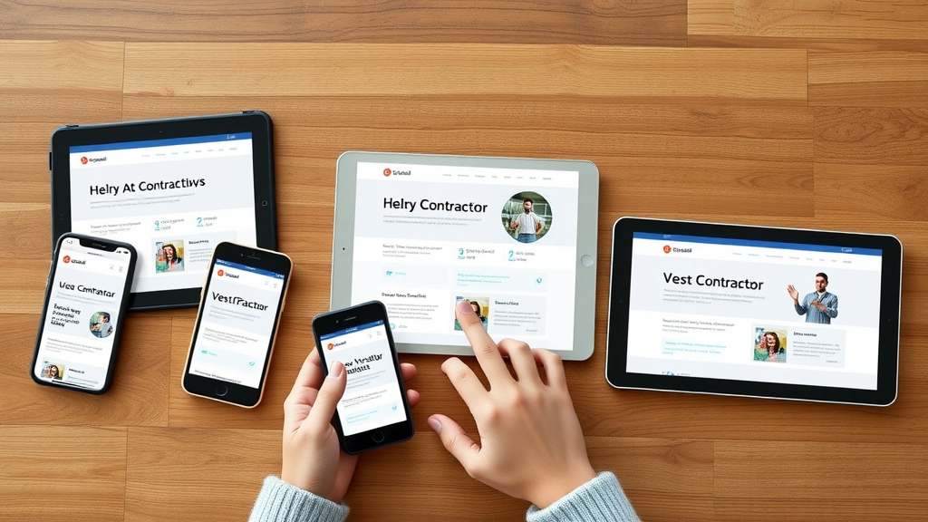
Watch this dynamic screen capture to see a contractor website’s layout seamlessly adjust between desktop, tablet, and mobile devices. Notice how navigation menus, content blocks, and contact forms remain accessible and visually appealing—on every screen size.
Frequently Asked Questions about Mobile-Friendly Websites for Contractors
-
Why is a mobile-friendly website critical for generating contractor leads?
With over half of online searches for contractors happening on mobile devices, a mobile-friendly website ensures you capture these leads, provide easy contact options, and keep users from bouncing to competitors due to frustration or usability issues. -
What are the most common mistakes in mobile website design for contractors?
Common mistakes include using small, unreadable fonts, cluttered layouts, slow load times, and failing to implement tap-friendly navigation menus. Overly large images and complex forms also drive users away from mobile websites. -
How do mobile users differ from desktop visitors on contractor sites?
Mobile users often look for quick answers: services offered, reviews, and easy contact methods. They expect fast load times and simplified navigation. Desktop visitors may spend more time reading details or comparing service packages, while mobile users want immediate action. -
Is responsive design the same as a mobile website?
Responsive design creates one flexible site that automatically adapts to any device, while a mobile website may refer to a separate version built just for phones. For most contractors, responsive design is best practice, offering a unified experience on both mobile and desktop.
The Impact of Mobile Website Design on Contractor Reputation
“A poor mobile web experience can cost contractors up to 40% of potential leads, while a friendly website design enhances trust.”
- First impressions through mobile websites
- Role of social proof and user reviews in mobile web
- Brand consistency across all web design elements

Your contractor reputation is built or broken in seconds on mobile devices. A smooth mobile web experience gives homeowners instant access to your portfolio, reviews, and contact options—turning casual visitors into loyal clients. On the flipside, a clunky or unresponsive site can drive away 40% of potential leads.
Social proof plays a huge role. Make customer reviews and ratings easy to find and visually accessible on your mobile website. Brand consistency, from colors to layout to tone, reinforces trust with every click. The better your mobile website design, the more likely visitors will convert and advocate for your business in their own networks and social media channels.
Key Takeaways from Building Mobile-Friendly Websites as a Contractor
- Mobile-friendly websites are now essential for contractors.
- Optimizing website design for mobile users brings more traffic and leads.
- Responsive design and practical navigation menus are best practices.
- Consistent monitoring with the mobile friendly website tool ensures ongoing performance.
Conclusion: Future-Proofing Your Contracting Business with a Mobile-Friendly Website

Investing in a mobile-friendly website is no longer optional for contractors—it’s a direct path to more leads, higher trust, and sustainable growth in a mobile-first world.
Book a Free Consultation or text Us 720.892.5968 to get started on your mobile web transformation today!


Write A Comment