


Did you know: For many service pros, nearly 70% of their booked jobs come from a single web page click—and that click depends on the button’s design. CTA design isn’t just a detail—it’s often the deciding factor between an inquiry and a lost lead. In this comprehensive guide, you’ll uncover what makes a call to action irresistible and how you can create the action button that turns website visitors into paying clients.
Startling Stats: Why CTA Design Is the Deciding Factor in Conversion Rate
In the digital age, cta design can make or break your conversion rate. According to recent studies, a well-designed action button can improve conversion rates by more than 30%. Website visitors form an impression of your business in under a second, and the call to action button plays a crucial role in guiding users to click. Effective cta design goes beyond mere aesthetics and delivers a message that creates a sense of urgency, highlights the benefit, and encourages user action. Whether you’re designing a landing page or updating your site’s navigation, the placement, color, and wording of your CTA button are essential to guide users toward the specific action you want them to take.
Putting effort into your CTA doesn’t just boost conversion rates—it enhances user experience, earning trust from your target audience. Service professionals who integrate compelling cta designs on their sites see noticeable upticks not just in click-throughs, but in qualified bookings. The statistics are clear: prioritizing cta design isn’t a luxury—it’s a necessity to stay competitive.
Did You Know? Most Users Judge a Service Pro by a Single Click (CTA Design in Action)
It’s no exaggeration: Clients often make snap decisions based on their first interaction with your web page. The cta design is frequently that “first impression.” When users see a clear, vibrant, and well-placed call to action, it signals professionalism and clarity—two qualities that instill confidence. Conversely, a muddled, hard-to-find, or uninspiring button can cause lost leads, no matter how strong your service offering is.
Research on user engagement suggests a strong cta button on your landing page can reduce bounce rates by up to 40%. Simple improvements such as a contrasting color, concise language, and logical placement above the fold can immediately make the button stand out and guide users to click. Remember, your action design is as much about the psychology of trust as it is about visual appeal.

What You'll Learn About CTA Design and Action Design for Service Pros
- Understand what makes effective CTA design
- Key elements of action design
- Best practices for color, shape, and placement
- How to increase conversion rate with compelling CTA
- See real cta examples and practical implementation tips
Understanding CTA Design: Definitions and Core Concepts
What is a CTA in Design?
A CTA in design stands for “Call to Action”—the element that prompts users to take a desired action, whether it’s booking a job, requesting a quote, or starting a free trial. In action design, the CTA button serves as a guide for users, channeling attention and encouraging engagement. Unlike regular buttons or links, CTAs are intentionally designed to be visually prominent, using contrasting colors, clear language, and strategic positioning. The end goal? To boost user engagement and maximize your website’s conversion rate by leading the target audience directly to the next step.
Effective cta design considers everything from color psychology—using hues that create a sense of urgency or trust—to the white space surrounding the button, which makes it stand out. For service pros, the cta makes all the difference: it’s the last nudge encouraging users to click.
What Does CTA Stand For?
The acronym CTA stands for Call To Action. In web and graphic design, a CTA refers to any visual or textual element that directs a user toward a specific action, such as “Book Now,” “Contact Us,” or “Start Free Trial.” In the context of cta design, these elements are crafted with intention: every detail—color, shape, text, and placement—works together to prompt immediate user interaction and subsequently increase conversion rates. The power of a CTA lies in its clarity and prominence, making it impossible for users to miss or misunderstand their next logical step.
What Does CTA Stand For in Graphic Design?
In graphic design, CTA represents “Call to Action”—a cue or button created specifically to grab attention and elicit a direct user response. The philosophy of action design is deeply rooted in making these cues unmistakable and compelling, combining bold typography, strategic use of contrasting colors, and psychologically driven micro-interactions like hover effects. Great cta design in graphics is more than visual decoration—it’s the difference maker when it comes to engagement and conversion on a web page.
What is an Example of a CTA?
Some classic cta examples include buttons labeled “Book Now,” “Get a Free Quote,” or “Schedule a Call.” The most effective cta buttons combine succinct, action-driven text with high visibility through contrasting colors and a logical place in the user’s journey. For instance, a bright, bold “Book Now” button above the fold (the area immediately visible when a landing page loads) stands out, especially if paired with a compelling hover effect. In service booking, these CTA buttons don’t just trigger clicks—they boost bookings by building user trust and making the next step obvious.
Key Components of Action Design
Action design is the process of building every aspect of a CTA button to maximize clarity and motivate users to click. Key components include: contrasting color, ensuring your button stands out; size and shape, making it large and inviting without dominating the page; strategic placement above the fold, where the user will immediately encounter it; and interactive touches such as a hover effect. Every element—down to the text used and the white space around the button—contributes to the overall efficacy, guiding users to the specific action and increasing conversion rate.
The Role of Conversion Rate in CTA Design
Conversion rate measures the percentage of users who take a desired action, such as booking a job after landing on your web page. The quality of your cta design directly influences this metric. A compelling cta makes it easier for the target audience to know what to do next and encourages user engagement, boosting not just clicks but meaningful conversions. Investing time in perfecting your action button means your marketing efforts pay off with higher ROI, more qualified leads, and a business that grows on autopilot, thanks to a seamless user experience.
Call to Action: Exploring Why It Matters for Service Pros
First Impressions: The Power of a Compelling CTA
Your website’s call to action is often the very first feature prospects engage with, and first impressions are lasting. A compelling cta creates a sense of trust and motivation, instilling confidence in users while guiding them to book your service. The action button acts as a handshake—offering reassurance that their next step is simple and secure. In markets crowded with competition, standing out can come down to a single, well-designed cta button that encourages user action and drives engagement and conversion.

How CTA Design Impacts Booking and Customer Trust
The connection between cta design and customer trust is strong. Inconsistent, poorly designed, or hidden CTA buttons raise doubts about a company’s professionalism—or even legitimacy. On the other hand, a vibrant, perfectly positioned button says, “This is what you do next. We’re ready to help.” When action design is executed well, it guides users to click and increases not just bookings, but positive perceptions about your brand. Over time, these micro-decisions add up to significant boosts in bookings and recurring business.
Anatomy of Effective CTA Design: Structure and Psychology
Contrasting Color and Contrasting Colors: The Science Behind Visibility
The secret to a high-performing cta button is visibility—and nothing drives visibility like the right contrasting color. Scientific studies show that the human eye is drawn to color contrasts, especially when a bright, saturated CTA stands out against a muted or neutral background. For example, an orange “Book Now” button on a predominantly blue web page harnesses the power of color theory to naturally draw focus. Using contrasting colors not only makes it stand out, but also signals importance and immediacy, increasing the likelihood of user clicks.
The role of color extends beyond aesthetics. It creates a sense of urgency, guides users to the intended action, and supports accessibility. A visually impaired user may rely on that same color contrast to navigate a landing page. Thus, carefully chosen contrasting colors are both a conversion tool and an inclusivity standard.
Button Size, Shape, and Placement in Action Design
Many overlook how the size, shape, and placement of the CTA button influence user decisions. Your button should be large enough to grab attention, but not so big that it overwhelms the other content or white space on the landing page. Rectangular with gently rounded corners is the most universally effective shape for guiding users’ eyes, according to usability research.
Placement is equally critical. The highest converting CTA buttons sit “above the fold,” ensuring every website visitor sees the call to action without scrolling. Strategic action design will on occasion repeat the CTA lower on the page for longer scroll experiences, always with enough white space to keep the button prominent and inviting.
The Role of Hover Effect in CTA Engagement
A hover effect is a subtle design technique that changes the appearance of a button (color shift, shadow, or slight motion) when a user’s pointer moves over it. These small, micro-interactions offer instant feedback, signal to users that the button is clickable, and make the action button feel modern and responsive. Studies show adding a well-executed hover effect can increase user engagement and conversion rate, as it creates a sense of urgency and invites clicks.
Compelling Text: From Passive to Action-Driven Language
The language on a call to action button matters as much as its color or size. Action-oriented text like “Book Your Free Estimate” or “Get Started Now” is proven to convert better than vague options. Effective cta design means using energetic, concise language, tailored to your target audience and aligned with the brand’s value proposition. The words should spark curiosity or present a clear benefit, making users eager to click and continue their journey.
Principles of Action Design: Maximizing Conversion Rate
Design Techniques That Boost Conversion Rate
To maximize conversion rate, implement design techniques that combine clarity with psychological triggers. Use white space to draw the eye, add urgency with phrases like “Limited Spots Left,” and create social proof near your action button (like client testimonials or ratings). Use a contrasting color to make sure your cta button isn’t lost in the design, and align every element—size, shape, text—with your overall goal. Testing different cta designs using A/B experimentation lets you continually refine for the best conversion rates.

Examples from Top Performing Call to Action Buttons
High-performing CTA buttons often share a few characteristics: bold, action-driven text; appropriate use of contrasting colors; succinct and compelling content; and a hover effect for instant feedback. Some real-world cta examples include “Claim Your Free Trial,” “Get Instant Estimate,” or “Schedule With an Expert Today.” Studying top cta designs shows a pattern of clarity and urgency—traits that encourage users to click and book.
Interactive Elements: Hover Effect and Micro-Interactions
Micro-interactions—like subtle movement, color flashes, or icon animations on hover—make cta buttons feel interactive and modern. When a hover effect is added to an action button, it gives feedback that reassures users and can even create delight. These elements reinforce user engagement by guiding users’ attention and encouraging user interaction, paving the way for higher conversion rates.
CTA Design in Practice: Real-World Cta Examples and Analysis
| CTA Example | Contrasting Color | Hover Effect | Reported Conversion Rate |
|---|---|---|---|
| “Book Now” (Orange on Blue) | High (Orange vs Blue) | Color deepen + shadow | 27% |
| “Get Free Estimate” (Green on White) | Medium (Green vs White) | Soft scale-up and border glow | 23% |
| “Schedule Today” (Red on Gray) | High (Red vs Gray) | Brightness pulse | 25% |
Dissecting Successful CTA Buttons in Service Booking
Why do some service pros get more clicks? The most successful cta buttons are those that stand out visually but feel natural within the site design. Real-world analysis reveals these buttons pair compelling, benefit-driven language (“Book Your Free Assessment”) with a contrasting color and a hover effect that provides tactile feedback. They're sized appropriately, surrounded by enough white space, and always placed where users’ eyes naturally land during their scroll through the landing page. The result? More job bookings and improved user trust in your business.
Common Mistakes in CTA Design and How to Avoid Them
Designers often stumble with poor color choices (making buttons hard to spot), using generic language (“Click Here”), or burying the cta below the fold. Other common mistakes include ignoring hover effects—missing out on those subtle cues that drive user engagement—and cluttering the page so much that the action button is lost in the noise. To avoid these pitfalls, focus on clarity, ample white space, a logical cta placement, and always test your design with real users to see what encourages them to click.
Step-by-Step: How to Create a High-Converting Call to Action
- Define the action design goal
- Choose compelling cta copy
- Select an effective contrasting color
- Optimize size, shape, and placement
- Integrate hover effect for engagement
- Test and refine for conversion rate improvements
"The best CTA design is one that users can’t help but click – every element should channel attention to that button." – UI/UX Expert
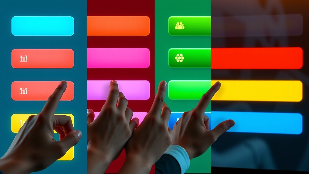
Visual Guide: CTA Design Gallery for Service Pros
Contrasting Colors in Action: CTA Image Gallery

Watch a detailed breakdown of what makes top cta buttons irresistible—see firsthand how professional designers make use of contrasting colors, hover effect, compelling copy, and optimal placement to create buttons that boost conversion rate effortlessly.
Hover Effect Demo: Capturing User Attention with Motion
Experience the subtle yet powerful impact of motion with a hover effect demonstration. See how interaction feedback visually guides users and drives more clicks through micro-animations and responsive design cues in action design.
Top 10 CTA Design Best Practices for Booking More Jobs
- Use clear and concise language
- Highlight the primary call to action
- Leverage contrasting colors
- Ensure mobile responsiveness
- Keep the CTA above the fold
- Add a hover effect for feedback
- Align CTA design with your brand
- Test different variations
- Use action-oriented verbs
- Reduce surrounding clutter
Common Pitfalls in CTA Design and How to Overcome Them
Color Choice Gone Wrong in Action Design
One of the most damaging mistakes is using insufficiently contrasting color for the action button, resulting in a cta that fails to attract attention. If your button blends into the background, it’s less likely to be clicked, harming your conversion rate. Opt for visually arresting colors that pop on your web page and always test contrast ratios for accessibility.
Misaligned Placement and Low Conversion Rate
Even great buttons flop if hidden where users won’t see them. Burying your cta button below the fold, in menu drop-downs, or among too many elements makes it easy to overlook. Always make the action button visible in the first screen view and repeat it as necessary throughout your landing page.

Ignoring Hover Effect and Missed Clicks
Skipping the hover effect robs users of vital feedback—it can cause hesitation or make a button appear static and uninviting. To encourage user clicks and engagement, add a responsive hover effect for every interactive action button on your site.
Accessibility in CTA Design: Ensuring Everyone Can Book
Choosing Accessible Contrasting Colors
A truly effective cta design accounts for all users, including those with visual impairments. Select contrasting colors that meet WCAG guidelines for minimum contrast ratios, ensuring that everyone can perceive and interact with your action buttons.
Text Size and Readability
Make sure your cta button features large, readable text that stands out even at a glance. Avoid script or thin fonts—a simple sans-serif in a large size maximizes readability for users on any device or screen size, further boosting conversion.
Keyboard Navigation and Action Design
Some users rely on keyboards to navigate your web page. Ensure every action button is both visually visible and accessible via the Tab key, with clear focus indicators in your cta design—so all users can easily take the desired action.
Frequently Asked Questions on CTA Design and Call to Action
What is a CTA in Design?
A CTA in design is a clear and concise button or link that prompts users to take action—such as 'Book Now' or 'Contact Us'—integrated within action design to increase conversion rates through compelling layout and contrasting colors.
What Does CTA Stand For?
CTA stands for “Call To Action,” which in the context of cta design, refers to any element designed to drive users toward a specific conversion objective.
What Does CTA Stand For in Graphic Design?
In graphic design, CTA stands for “Call to Action,” meaning a visually prominent cue, often a button, designed to prompt immediate user response, employing creative action design and color psychology to increase conversion rate.
What is an Example of a CTA?
A strong CTA example is a large, contrasting “Book Now” button placed above the fold and featuring a hover effect to encourage clicks and bookings.
People Also Ask: Dive Deeper into CTA Design
What is a CTA in design?
A CTA in design is a clear and concise button or link that prompts users to take action—such as "Book Now" or "Contact Us"—integrated within action design to increase conversion rates through compelling layout and contrasting colors.
What does CTA stand for?
CTA stands for 'Call To Action,' which in the context of CTA design, refers to any element designed to drive users toward a specific conversion objective.
What does CTA stand for in graphic design?
In graphic design, CTA stands for 'Call to Action,' meaning a visually prominent cue, often a button, designed to prompt immediate user response, employing creative action design and color psychology to increase conversion rate.
What is an example of a CTA?
A strong CTA example is a large, contrasting 'Book Now' button placed above the fold and featuring a hover effect to encourage clicks and bookings.
Take an exclusive look into top agency design teams collaborating on CTA strategy—watch as they iterate on color choices, conduct real user tests in modern offices, and optimize buttons with live A/B testing dashboards revealing boosts in conversion rate and user engagement. See the best practices of high-traffic agencies and learn how you can adapt their lessons to your own service business.
Key Takeaways: CTA Design Strategies for Booking More Jobs
Build your cta design around clarity, visibility, and direct language. Prioritize a strong contrasting color, easy-to-read text, and a responsive hover effect. Test variations and always ensure accessibility for every user. Refine these elements for a booking button that converts every time.
Ready to Transform Your Booking Experience with Outstanding CTA Design? Book a Free Consultation or text Us 720.892.5968
Don’t leave conversions to chance—upgrade your action design today. Book your free consultation, and let’s craft the cta button that brings in more jobs than ever before!


Write A Comment